如何挖掘有潜力的NFT?聪明的玩家都在用这5个工具
撰文:Nansen
Non-Fungible Token (NFT) 市场有太多的噪音。每天都会产生无数新的 NFT 项目,这些项目有可能创造 NFT 行业的未来,或破坏你的投资,让你亏钱。与此同时,市场上的项目——包括像 BAYC 和 Doodles 这样的 NFT 巨头——不断提高他们的游戏水平,以在注意力经济中获得更大的蛋糕。
以上都创造了一个复杂环境,投资者很难在 NFT 大海中并找到合适的项目进行投资。为了减轻过多信息的负担,我们准备了一个列表,其中包含一堆免费的 NFT 数据分析工具。
我们鼓励那些刚接触 NFT 世界或想重温记忆的人开始他们的探索旅程,我们的 NFT 介绍性文章、关于投资 NFT 时应注意什么的综合文章,以及我们的如何购买他们的第一个指南 NFT。在那之后,我们希望这个完整的工具箱足以让投资者对 NFT 市场有敏锐的关注。
Nansen
Nansen,这个投资分析平台,可以理解成,为用户装备了一套高度通用的分析工具,而且它还在不断更新。它不仅提供 NFT 的基本数据(即平均价格、市场交易量、钻石手 hodlers 详细数据),还允许通过基于钱包的分析和可定制的智能链上警报进行市场跟踪,来交叉引用投资组合。
NFT Paradise 天堂是 Nansen 进入 NFT 市场的主要窗口,提供对市场总体状况的独家见解。它包含一个利润排行榜,给用户介绍下该领域最赚钱的投资者,并让用户学习分析他们之前的投资决策。通过钱包分析器,用户可以查看盈利钱包地址的交易历史,了解他们目前持有哪些蓝筹股或失败的 NFT 集合,并观察他们如何在实现短期收益,对抗市场周期性和长期持有信念之间取得平衡。
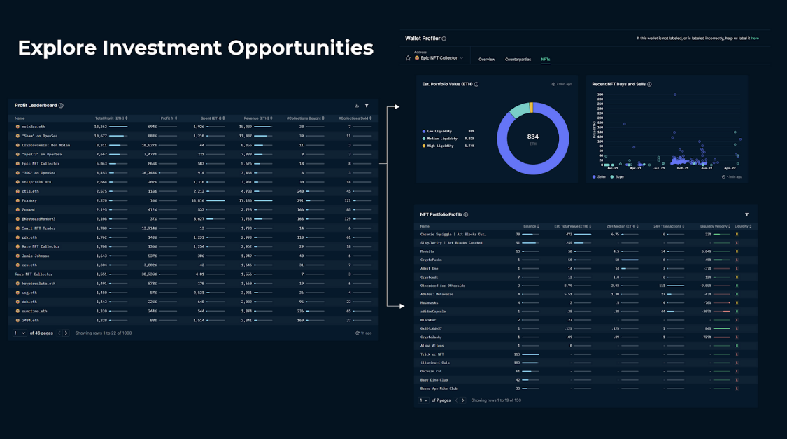
同时,铸造大师 (Mint Master) 功能非常适合发现市场上的最新项目,数据面板实时展示最热门的 NFT Mint 项目,并附有高利润铸造玩家(聪明铸造者)在这些新项目中的位置的信息。虽然利润排行榜没有将来自二级市场购买和铸币的利润分开,但铸币排行榜只对最赚钱的铸币者进行排名,从而显示那些善于寻找最新市场机会的人。对于快节奏的交易活动非常方便,尤其是与聪明钱跟踪结合使用时,可以查看成功的投资者何时买卖。
聪明钱活动 Smart Money
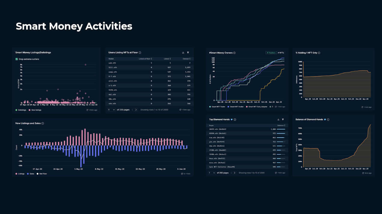
一旦你看到一个有趣的 NFT 项目,Nansen 的 NFT 上帝模式就是在项目层面进行详细调查的首选解决方案。它通过对 钻石手 (hodler) 行为的广泛分析来补充收集历史数据。通过数据面板显示 smart money 参与项目、hodlers 的持有市场、鲸鱼行为和上市细节,它使用户能够对项目参与者和绩效指标进行严格的研究。要获得有关参与者的更有意义的见解,用户可以参考相关的收藏选项卡,并查看其他 NFT 项目持有者在财务上与哪些相关。
这些工具与 Nansen 的智能警报结合使用时可发挥最大潜力,允许用户为自己喜欢的收藏或钱包地址创建自定义警报,并获得实时通知。跟踪聪明的铸造者、买入和卖出的即时通知对于驾驭动荡的市场条件非常有价值。
要了解有关投资者如何有效使用 Nansen 的更多信息,请观看最近一期 Nansen Office Hours,我们的 Alpha 团队展示了如何使用 Nansen 在 NFT 市场中寻找 Alpha。
Etherscan
区块浏览器是链上原住民的最亲密的朋友。 Etherscan 是用于分析以太坊区块链上的活动的主要工具,它可以未经过滤地访问区块链数据。它详细列出了以太坊交易历史,并展示了任何人都可以访问的经过验证的智能合约代码。您可以使用该网站找到任何 ERC-20 代币、ERC-721 代币(NFT 集合)和钱包的所有链活动,使其成为做好准备调查的有用工具。它剖析每笔交易以显示其属性,无论它们是用于简单的转移、借贷活动、交易还是其他类型的活动。该网站甚至可以作为一个粗略的前端,投资者可以在其中与经过验证的智能合约进行交互,并从链上发送、质押或获取有关其 NFT 的信息。
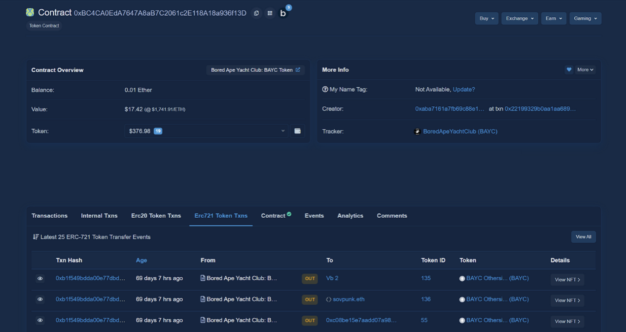
熟悉 Etherscan 并处理海量数据最初可能会让人不知所措。坦率地说,这就是为什么我们说它对结构化研究非常有用。然而,作为 NFT 投资者,习惯 Etherscan 是初级的,因为它不仅用于做出明智的投资决策,还用于在链上做任何事情。
NFT Bank
NFT 投资者受益于拥有用于管理其数字艺术收藏和分析其投资策略盈利能力的个性化工具。 NFT Bank 是一个免费且功能强大的投资组合跟踪器,可让用户跟上他们的投资。其用户友好的平台可以访问有关您的购买和销售历史的详细信息、数字资产展示以及钱包的个性化详细信息,以及 NFT 和钱包级别的 ROI 分析工具。
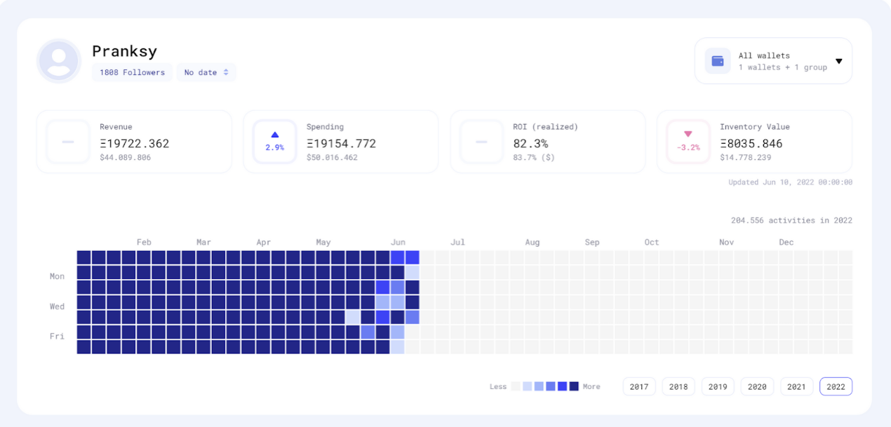
NFT Bank,通过追随者展示工具和他们自己的价格估算工具来补充这些服务,以便用户发现,可能以折扣价出现的与价格趋势不同的作品。它甚至提供了一个税务服务商来帮助用户处理 NFT 资产的税务申报。
NFT Evening
尽管它不是一个分析平台,但 NFT Evening 可以被视为与行业信息保持同步的宝贵资源。该网站涵盖了市场上的最新项目,提供来自不同 NFT 垂直领域的最新消息,并为 Mint 铸造开始时间和会议提供 NFT 日历, NFT Evening 可以被视为社交媒体应用程序的补充信息工具。
结论
由于加密 NFT 世界将自由参与与经济激励相结合,结果是 NFT 迅速成为一个成熟的实验行业。然而,本文中提供的分析平台有望总结为一个完整的工具包,帮助用户在 NFT 投资领域的波涛汹涌的大海中航行。